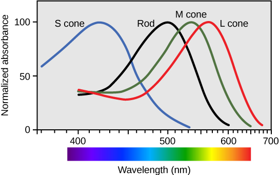
Ever wondered how two people can look at the same set of objects and perceive it totally differently? The answer partly relies on the physics lens; we can see that light behaves as an electromagnetic wave, where an object’s color is perceived from a combination of specific wavelengths that are reflected or absorbed, with the visible wave bands occupying a spectrum between 380 and 700 nanometers (NASA 2010). The physical light that hits your eyes at any given moment depends on two variables, the inherent properties of the object itself and the nature of the ambient lighting shining upon it. Our eyes receive this information, but it’s totally ambiguous, and our brain’s job is to perceive this data and connect the dots, creating a world that is coherent. It does so using three photoreceptor cones, designated as S, M, and L within our retinas that detect these wavelengths. The letters are representative of the length of the wavelengths; S cones respond to short waves, most strongly around 420nm, M cones respond to medium wavelengths, most strongly around 530nm, and L cones respond to long wavelengths, most strongly at 560nm (Bowmaker and Dartnall 1980). These signals get sent to the visual cortex within the occipital lobe of your brain. Your brain then uses them to create color (Spielman, Jenkins, and Lovett 2020).
But what stops your brain from getting confused by the given changes in color caused by lighting changes? It’s a perceptual mechanism called color constancy, which lets you recognize the true color of an object no matter if it’s basking in sun or sitting in a dimly lit room (Foster 2011). It explains the viral phenomenon of “the dress”, a photo that went global, sparking a debate of whether or not it is blue and black, or white and gold. A survey was then conducted by Lafer-Sousa and her colleagues and of the over 1400 people they asked, 57% of them saw blue/black, 30% of them saw white/gold, 11% of them saw blue/brown and 2% of them saw something else. The ambiguous lighting in the photo forced viewers to interpret cool shade (making it appear white/gold) vs warm lighting (making it appear blue/black) and is a perfect example of the same physics yielding completely different perceptions in the brain (Lafer-Sousa, Hermann, and Conway 2015).
Ultimately, this disconnect between raw data and interpretation is what matters significantly for scientists. It’s a reminder that there is no purely passive interpretation of images, charts and empirical data when it’s perceived visually and that it’s important to recognize internal biases and minimize them in the pursuit of scientific research.
References
Bowmaker, J. K., and H. J. A. Dartnall. 1980. “Visual Pigments of Rods and Cones in a Human Retina.” Journal of Physiology 298: 501–11. https://doi.org/10.1113/jphysiol.1980.sp013097.
Foster, David H. 2011. “Color Constancy.” Vision Research 51: 674–700. https://doi.org/10.1016/j.visres.2010.09.006.
Hutchins, Jim. 2024. “Color Processing in the Retina.” In Introduction to Neuroscience. Pressbooks. https://uen.pressbooks.pub/introneuro/chapter/color-processing-in-the-retina/.
Lafer-Sousa, Rosa, Katherine L. Hermann, and Bevil R. Conway. 2015. “Striking Individual Differences in Color Perception Uncovered by ‘the Dress’ Photograph.” Current Biology 25 (13): R545–46. https://doi.org/10.1016/j.cub.2015.04.053.
NASA. 2010. “Visible Light.” NASA Science. https://science.nasa.gov/ems/09_visiblelight/.
Spielman, Rose M., William J. Jenkins, and Marilyn D. Lovett. 2020. Psychology 2e. Houston: OpenStax. https://openstax.org/books/psychology-2e/pages/5-2-waves-and-wavelengths.


Leave a Reply
You must be logged in to post a comment.