If I asked you what colour the ocean is, you would probably say blue. After all, this is a fundamental truth that we’ve been taught since we were young. Trees are green, fire trucks are red, and the ocean is blue. But how do we know if we are all perceiving the same colours? In other words, is your blue my blue?
Looking at the biology of our eyes, we should all see the same colours. Our eyes contain photoreceptors called rods and cones, which are specialized cells that take in light information and convert it into electrical signals that travel to our brains (see Figure 1). Rods make up most of the photoreceptors and are more sensitive in dim light, while cones are more sensitive in daylight. Three types of cones exist which can detect blue, green, and red wavelengths. The visible light spectrum we are able to see is the result of the overlap of detectable wavelengths between these three types of cones (Nguyen et al. 2023).
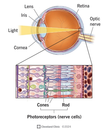
It is when our brains attempt to interpret this information when differences in colour perception may arise. After light is absorbed by a cone cell, retinal signals are transmitted to various cortexes and areas of the brain, which can each serve different purposes. In a simplified explanation, each of these steps serve as a component in building an overall picture. For example, the neurons in the primary visual cortex produce local colour contrast while glob cells help to perceive hue (Conway 2009).
Colour perception may be influenced by physical factors, such as the density of macular pigments, which can change depending on a variety of factors such as diet, gender, iris colour, and age. These pigments exist on the macula lutea of the retina and are yellow due to the presence of the carotenoids lutein and zeaxanthin. These are able to trap short wavelength light, protecting the eye from the oxidative damage that is believed to play a role in age-related macular degeneration (Whitehead et al. 2006). So, while these pigments do serve a purpose, they may alter the way we see certain colours.
Moreover, colour perception may be influenced by behaviour, as demonstrated by “The Dress”, a picture that went viral in 2015 for splitting opinions on whether it was blue and black or white and gold (see Figure 2).
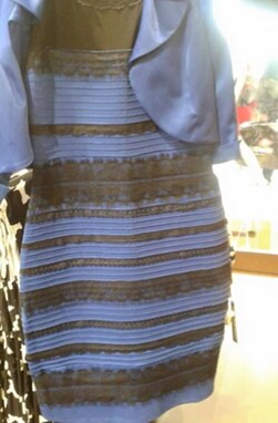
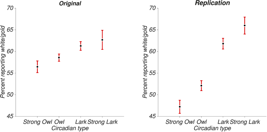
It was determined that the main reason for the disagreement in colour was due to differences in the perceived lighting. One study proposed that this could be explained by circadian behaviour. Participants were asked whether they identified as a “lark” (an early riser and early sleeper), or an “owl” (a late riser and late sleeper), and how this corresponded to what colour of dress they saw (see Figure 3). Results from both trials showed that larks tended to see the dress as white/gold more than owls. Later in the study, it determined that this was due to larks assuming the photo was taken in natural light, while owls assumed the lighting was artificial (Wallisch 2017).
Returning to the original question, although our eyes receive the same wavelengths, our brains may interpret them in different ways depending on factors such as macular pigment density or circadian behaviour. So, it may very well be that your blue is not my blue.
References
Cleveland Clinic. 2024. “Photoreceptors (rods and cones).” Photograph. https://my.clevelandclinic.org/health/body/photoreceptors-rods-and-cones.
Conway, R. Bevil. 2009. “Color Vision, Cones, and Color-Coding in the Cortex.” The Neuroscientist 15(3): 274-290. https://doi.org/10.1177/1073858408331369.
Nguyen, Kevin H., Bhupendra C. Patel, and Prasanna Tadi. 2023. “Anatomy, Head and Neck: Retina.” StatPearls Publishing. https://pubmed.ncbi.nlm.nih.gov/31194472/.
Wallisch, Pascal. 2017. “Illumination assumptions account for individual differences in the perceptual interpretation of a profoundly ambiguous stimulus in the color domain: ‘The dress’.” Journal of Vision17 (4): 5. https://doi.org/10.1167/17.4.5.
Whitehead, A. Jeffrey, Julie A. Mares, Ronald P. Danis. 2006. “Macular Pigment: A Review of Current Knowledge.” Arch Ophthalmol 124 (7): 1038-1045. https://doi.org/10.1001/archopht.124.7.1038.
Wikipedia. 2015. “The dress.” Photograph. https://en.wikipedia.org/wiki/The_dress.
Comments
9 Responses to “Is Your Blue My Blue?”
Hey iSci!
I originally came about this topic after an activity we did in a data literacy lecture about the assumptions we make about the world. We had to categorize ourselves based on whether we believed the world we live in is an objective physical universe or if it is an illusion we all experience.
This exercise reminded me of a question I had long pondered: are the colours that I see the same that you see? Originally, the question posed as more of a philosophical thought than a science topic, as with our current technology, we are not able to experience the world from another person’s view. However, after doing more research, I was able to look at it from a more scientific perspective, taking into account eye anatomy and human behaviour to try and answer this question.
Additionally, I was a bit unsure of how to cite “The Dress” photo properly, since the original post came from Facebook and I was unable to access it directly. I was able to get the photo from Wikipedia, but I wasn’t sure if I was supposed to include it in my list of references at the bottom. If you know the proper way to cite, please let me know!
Anyways, I hope you enjoyed reading my blog and perhaps learned something new. I look forward to any feedback or comments on how I can improve!
Thanks,
Cheron
Hi Cheron,
Great work on this blog post. Your writer’s voice is very clear. My feedback:
-You should cite ALL of your sources used, including where you retrieve your figures from (Wikipedia). Furthermore, try to expand the number of sources (at least 5) you discuss, as more than half of your post is from one website and one study. You risk paraphrasing the entire study rather than using it as a source of support.
-P5, S1, consider removing “Experts were able to determine that…” from the beginning for conciseness.
– I think you may have a bit of an imbalance in the figures. Consider removing some of the statistical figures and summarizing them textually near the end, as 3 figures from one source is, again, almost a paraphrasing of the study. You only really need two or three in one post. Consider having a diagram of photoreceptors in the eye instead, maybe at the beginning.
Great work, and happy editing!
Angie
Hi Angie,
Thanks for replying to my blog, I appreciate the comments!
Upon revision, I added Wikipedia as a source and shortened the amount of information from the one study (this speaks to the last comment as well as I removed two of the figures and summarized them textually instead) so I could include more sources which discuss other things. Near the beginning, I also added a diagram of the photoreceptors in the eye as well.
Thanks again,
Cheron
Hi Cheron,
This was a great blog post and I really enjoyed reading it. I liked how you walked through the Wallisch study step by step and used lots of figures to support your point. Here are some things you could improve on.
-Try to integrate your figures directly into the text and call back on them. The results are explained well but should be discussed more in body paragraphs too. eg. something like “… as figure 4 shows…”
-The point about lens and macular pigment is addressed but isn’t really connected back to the rest of the evidence, try to draw it back to the main point.
Otherwise, this is a very well written post and I hope my suggestions help make it better.
-Vaughn
Hi Vaughn,
Thanks for making comments on my blog!
I tried to integrate the figures directly into the text by discussing the results in the body paragraphs instead and summarizing the information from the other two figures. Additionally, I was able to add more information about the macular pigments and connect it back to colour perception.
Thanks again,
Cheron
Hi Cheron,
Great post! I actually wrote about why people perceive The Dress to be different colours for one of my first year blog posts, so it was great to read about this from a different angle. Here are some things I would suggest improving:
– Your conclusion is a bit wordy, so I recommend rewording it to: “Although our eyes make take in the same wavelengths, our brains may interpret them in different ways depending on factors such as behaviour.”
– This is more stylistic and completely optional, but I also recommend combining your third and fourth figures into figure 3 (a) and (b), as your current structure seems to drastically split up your post
Other than that, great post and happy editing!
– Jessica
Hi Jessica,
Thanks for your suggestions!
It’s so cool that we both wrote about the same topic, I’ll definitely have to go look yours up from your first year blog posts! I attempted to make my conclusion more concise, taking out the filler words. I agree with your suggestion about combining my third and fourth figures, but I ended up taking them out and summarizing them in the text instead.
Again, thank you for reading and making comments!
Cheron
Hi Cheron,
I thoroughly enjoyed reading this, amazing job on your first blog post! I thought the opening question about whether “your blue is my blue” was really interesting and did a great job of introducing the topic of colour perception. The topic of “The Dress” also made the topic really easy to understand and connect to!
I just have a few suggestions for you while you edit!
– In your third block of writing, consider rewording “It is from this where differences in colour perception may arise” to make the sentence flow a little more smoothly.
– Try shortening some of your figure captions, especially figure 2-4, so the main information is easier to understand at a quick glance. I would
– you could add a sentence explaining how the brain interprets the signals from the cones, since this is an important part of your main argument.
– The mention of macular pigment could be further expanded or explained in relation to your topic to make the reader understand its importance.
-You could mention why this discovery could be important in our lives, or how it would change everything we’ve believed to be true!
Again, amazing job on your blog post!! I can’t wait to read the final version of your writing.
Hi Albesa,
Thank you for your suggestions, I’m glad you liked my opening question!
I edited the third block of writing to make it more concise and shortened my figure title, discussing them in the body paragraph instead. I added a paragraph on how the brain interprets signals from the cones and expanded more on the topic of macular pigments, as I agree that this is an important part of my argument. I also would have wanted to discuss the importance of this discovery, however, the word count limited what I was able to write about.
Again, thanks for your comments!
Cheron